Character mistake: After the things let the dog out, Larry calls Joan and tells her that the kids let him out, and he will get him (the dog). Later, when he's downtown with the dog, he has the line about "when Joan finds out you've escaped, Conrad's out and I'm in". Where is the surprise? He already called her, so she knows!

The Cat in the Hat (2003)
1 character mistake
Directed by: Bo Welch
Starring: Alec Baldwin, Dakota Fanning, Mike Myers, Kelly Preston, Spencer Breslin

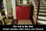
Continuity mistake: At the end of the movie when the Cat finished cleaning up the mess and was packing Thing 1 and Thing 2, everything looks immaculate except in one scene, in the corner of the living room, there are still purple splashes.
Cat in the Hat: Here she is. The Super Luxurious Omnidirectional Whatchamajiggar. Or S.L.O.W. For short.
Sally: S.L.O.W.?
Cat in the Hat: Yeah, S.L.O.W. It's better than the last thing we had. Super Hydraulic Instantaneous Transporter.
Conrad: Oh, you mean...
Cat in the Hat: Quick! To the S.L.O.W.!
Trivia: Mike Myers clicks his fingers to left and then the right of his face and then moves his waist up in a circular motion. He did the same thing in Austin Powers: The Spy Who Shagged Me.
Question: What year is this film set in? The clothing and architecture don't make it clear. Is it meant to be timeless?


Chosen answer: Theodor Seuss Geisel, or Dr. Suess as we know him, published most of his books between the late 1930's and the late 1980's. "The Cat in the Hat" was first published in 1957. Dr. Seuss' works generally tell the stories of fantastical characters in imaginary places, meant to be timeless. Illustrations and animated adaptations show buildings and objects with unusual proportions, odd shapes and bizarre functions. The live action film of "The Cat in the Hat, " however, is rooted to reality by its decidedly human child protagonists in an ordinary house in an ordinary neighborhood. The production design, costume design and set decoration of the 2003 film seem also to have the goal of achieving a certain timelessness. No date reference is given. However, there a decidedly stylized quality of 1950's-1960's suburban architecture and design, complete with its generic forms, chimneys, picket fences, and colors such as yellows and avocado greens, reflecting the common decor of the time. Similar to the 1971 TV short, which seems to provide a reference point for the design aesthetic of the film, nothing appears exceedingly futuristic nor rooted in period styles like victorian or colonial. I have also posed your question to Rita Ryack, the film's costume designer, whom I found on Facebook. If she sees my questions and decides to respond, I will add her insights to this answer.