Question: What year is this film set in? The clothing and architecture don't make it clear. Is it meant to be timeless?

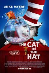
The Cat in the Hat (2003)
1 question
Directed by: Bo Welch
Starring: Alec Baldwin, Dakota Fanning, Mike Myers, Kelly Preston, Spencer Breslin
Continuity mistake: When Larry takes out his teeth when going to sit on his chair just before the repo men come and take his TV, he puts his false teeth in a glass. Immediately after that you can see his top teeth still in.
Cat in the Hat: Here she is. The Super Luxurious Omnidirectional Whatchamajiggar. Or S.L.O.W. For short.
Sally: S.L.O.W.?
Cat in the Hat: Yeah, S.L.O.W. It's better than the last thing we had. Super Hydraulic Instantaneous Transporter.
Conrad: Oh, you mean...
Cat in the Hat: Quick! To the S.L.O.W.!
Trivia: When the dog runs out we can see another dog in a doghouse, it's the same dog from Men In Black, and it's also called Frank.
Join the mailing list
Separate from membership, this is to get updates about mistakes in recent releases. Addresses are not passed on to any third party, and are used solely for direct communication from this site. You can unsubscribe at any time.
Check out the mistake & trivia books, on Kindle and in paperback.


Chosen answer: Theodor Seuss Geisel, or Dr. Suess as we know him, published most of his books between the late 1930's and the late 1980's. "The Cat in the Hat" was first published in 1957. Dr. Seuss' works generally tell the stories of fantastical characters in imaginary places, meant to be timeless. Illustrations and animated adaptations show buildings and objects with unusual proportions, odd shapes and bizarre functions. The live action film of "The Cat in the Hat, " however, is rooted to reality by its decidedly human child protagonists in an ordinary house in an ordinary neighborhood. The production design, costume design and set decoration of the 2003 film seem also to have the goal of achieving a certain timelessness. No date reference is given. However, there a decidedly stylized quality of 1950's-1960's suburban architecture and design, complete with its generic forms, chimneys, picket fences, and colors such as yellows and avocado greens, reflecting the common decor of the time. Similar to the 1971 TV short, which seems to provide a reference point for the design aesthetic of the film, nothing appears exceedingly futuristic nor rooted in period styles like victorian or colonial. I have also posed your question to Rita Ryack, the film's costume designer, whom I found on Facebook. If she sees my questions and decides to respond, I will add her insights to this answer.