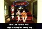
Factual error: In the scene where the kids are viewing the cupcake baking, there is a sign in the corner reading "laugh". The sign is facing towards the chef, when it should be facing the crowd. (00:31:40)
Factual error: When driving the S.L.O.W., the Cat tells Conrad to "punch it!". When he (Conrad) does so, the Cat squashes up against the windshield. This goes against physics. Unless they were going backwards, he would have been pressed into the seat.


Chosen answer: Theodor Seuss Geisel, or Dr. Suess as we know him, published most of his books between the late 1930's and the late 1980's. "The Cat in the Hat" was first published in 1957. Dr. Seuss' works generally tell the stories of fantastical characters in imaginary places, meant to be timeless. Illustrations and animated adaptations show buildings and objects with unusual proportions, odd shapes and bizarre functions. The live action film of "The Cat in the Hat, " however, is rooted to reality by its decidedly human child protagonists in an ordinary house in an ordinary neighborhood. The production design, costume design and set decoration of the 2003 film seem also to have the goal of achieving a certain timelessness. No date reference is given. However, there a decidedly stylized quality of 1950's-1960's suburban architecture and design, complete with its generic forms, chimneys, picket fences, and colors such as yellows and avocado greens, reflecting the common decor of the time. Similar to the 1971 TV short, which seems to provide a reference point for the design aesthetic of the film, nothing appears exceedingly futuristic nor rooted in period styles like victorian or colonial. I have also posed your question to Rita Ryack, the film's costume designer, whom I found on Facebook. If she sees my questions and decides to respond, I will add her insights to this answer.